A Complete Institute of Fine Arts & Crafts in India
Institute of Fine Arts & Crafts
As a student of fine arts or design, it’s important for you to have a solid command of colour theory. Colour theory is the art of combining colours based on the colour wheel, an organized illustration of the primary, secondary and tertiary colours. Accurately combining colours, using the colour wheel, and understanding how colours relate to each other are critical skills for artists, designers, marketers, and brand owners.
Colour is the element of art that is produced when light, striking an object, is reflected back to the eye.

Primary Colours include Yellow, Red, and Blue. These are colours that can’t be created by mixing other colours. Instead, they combine to create secondary colours, which in turn combine to create tertiary colours. In effect, all colours stem from the three primaries.


Secondary colours include orange, green and purple, and they’re derived from mixing equal amounts of two primary colours at a time. Yellow and Red combine to make Orange; Yellow and Blue yield Green; and Red and Blue create Purple. Remember that the ratio of each colour you use when mixing them affects the final hue. For example, combining 1 part red with 1 part blue will create one shade of purple, while combining 1 part red with 2 parts blue will create a darker, more blue-tinged hue of purple.
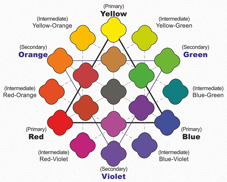
Tertiary colours, also known as intermediate colours, are made by combining equal parts of primary and secondary colours. Sometimes they’re named after the two colours that created them, such as blue-green or orange-red, and sometimes they’re called by their own name. There are six in total: vermilion (red-orange), magenta (red-purple), violet (blue-purple), teal (blue-green), chartreuse (yellow-green) and amber (yellow-orange).
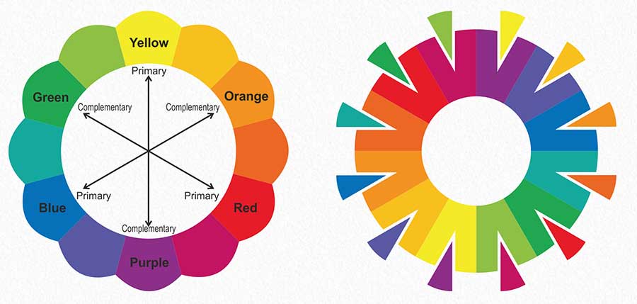
Complementary colours are hues that contrast with each other and are positioned exactly opposite one another on the colour wheel. The colour wheel is an arrangement of all colours on the spectrum based on their relationships, and it’s useful in creating harmonious colour schemes. Complementary colours enhance each other’s intensity when placed right next to each other, which is why they’re often used to create bold, high-contrast images that pop.
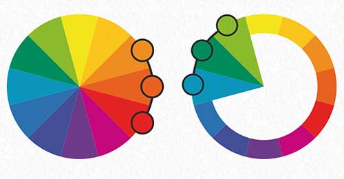
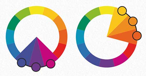
Analogous colours are adjacent to or near each other on the colour wheel. Together, they look aesthetically pleasing and produce a calming effect, as opposed to the intensity of complementary colours. Typically, one colour in a scheme of analogous colours is the dominant hue, a second colour supports it, and a third colour acts as an accent. Analogous schemes are often used in artworks that depict nature or calming scenes.
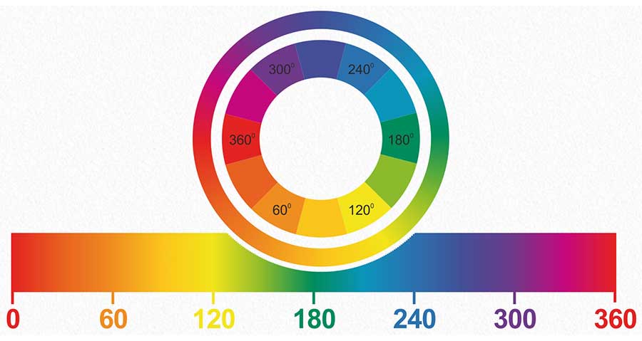
The colour wheel, sometimes called a colour circle, is a circular arrangement of colours organized by their chromatic relationship to one another. The primary colours are equidistant from each other on the wheel, and secondary and tertiary colours sit between them. It’s used in art and design to choose colours and colour schemes based on their relationships to one another.

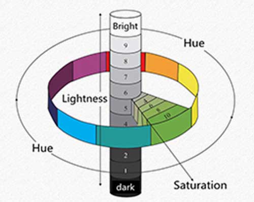
There are Three Properties of Colours

Many people use terms like 'Hue' and 'Colour' or 'Tint' and 'Shade' interchangeably, but the terms have distinctly different meanings. Colour is a very general term used to describe every hue, tint, tone or shade we can see. Hue refers to the dominant colour family.

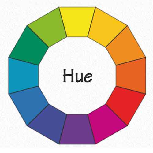
Hue refers to the origin of the colours we can see. Primary and Secondary colours (Yellow, Orange, Red, Violet, Blue and Green) are considered hues; however, tertiary colours (mixed colours where neither colour is dominant) would also be considered hues.
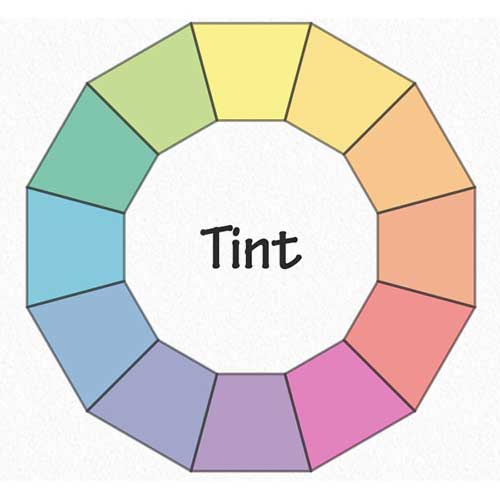
Tint refers to any hue or mixture of pure colours to which white is added. Pastel colours are generally tinted colours. The tinted colour remains the same colour, but it is paler than the original. When creating a tint, always begin with white paint and gradually mix in small amounts of colour until you’ve achieved the tint you want.
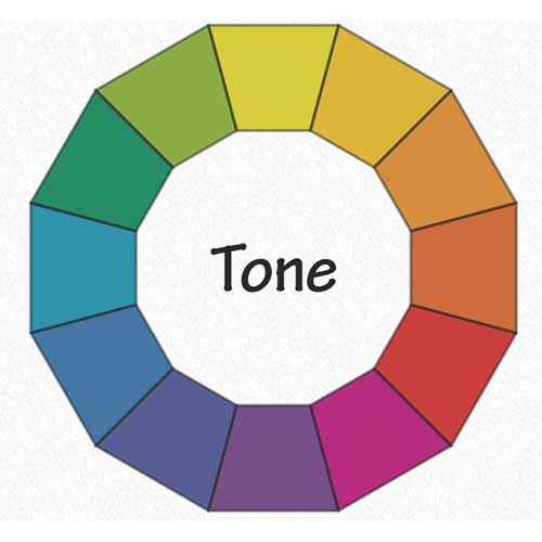
Tone is a hue or mixture of pure colours to which only pure gray is added (equal amounts of black and white). Adding gray to a colour will make the intensity much duller. Beware of mixing too much gray into a hue as it can become over-dulled and virtually impossible to restore the brilliance.
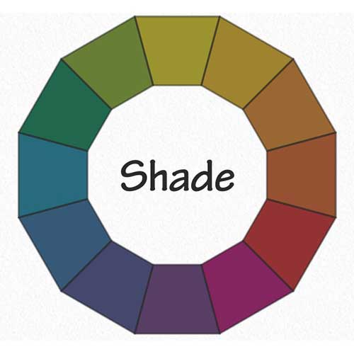
Shade is a hue or mixture of pure colours to which only black is added. It contains no white or gray. Shade darkens the colour, but the hue remains the same. When create a shade, begin with the colour itself then add black one drop at a time.

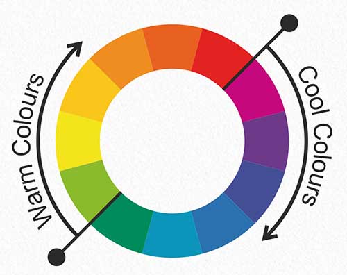
Do colours ever make you feel warmer or cooler? Sure they do! If you step into a room filled with yellows and oranges you are certain to start feeling warmer. Conversely, if you stepped into a room filled with blues you would start to feel much cooler. In this way from the relationship of warm and cool colours, we get a sense of colour temperature by a visual means vs colour temperature in the physical metric of hot and cold.

Most theories start with the colour wheel (three primary colours and three secondary colours). A dividing line splits the wheel into warm and cool. The warm colours are Red, Orange and Yellow; and the cool colours are Green, Blue and Magenta.


Colours and objects that allow all light to pass through are called transparent. Colours and objects that allow some light to pass through are called translucent. Colours and objects that don't allow any light to pass through are called opaque.

A monochromatic colour scheme is a colour palette in which a single colour tint is used as the basis for all shades and hues found within the image. The shade of colour is varied by changes made to the saturation and/or brightness of the base colour.
In today’s digital world, artists no longer need to depend only on galleries or local exhibitions to sell their artwork. The internet has opened new opportunities where artists can showcase their creativity to a global audience.
read moreMany people feel interested in art and creativity but often feel confused about where to begin. Questions like “Which art course is best for beginners?
read moreWhenever we create an artwork there are 7 elements or components, that our artwork consists of. In most cases, we take these elements for granted or don't even think about them twice.
read moreNo wonder, the enchanting Madhubani Art has traveled across many ages to reach you today! Folktales from the great Hindu epic Ramayan describe the auspicious birth of ‘Shree Sita’ from the sacred soil of Mithila.
read moreColour schemes in art refer to the organised and intentional use of colours to create specific aesthetic or emotional effects in a piece. They are essential for creating harmony, balance, and mood in visual compositions.
read moreAs a student of fine arts or design, it’s important for you to have a solid command of colour theory. Colour theory is the art of combining colours based on the colour wheel, an organized illustration of the primary, secondary and tertiary colours.
read moreToday, the world is at war again. An invisible war. Dangerous too. The enemy is within us. In our stressed minds, sad thoughts, jealousy and troubles. But just as there is always a silver lining in dark clouds, there is hope for recovery.
read moreछुट्टियों की दस्तक हो चुकी है! और सच बताना छुट्टियाँ किसे पसंद नहीं? इनकी प्रतिक्षा तो हर कोई बड़ी बेसब्री से करता है। जीवन में इनका महत्व ठीक वैसा है जैसे किसी हरे-भरे खेत में कल-कल करती नहरों का। हर किसी के पास चाहे वो बड़े हो या बच्चे, छुट्टियों को बिताने का ढेर सारा प्लान होता ही है!
read moreBFA is a degree level program that is meant for students who have a passion for learning fine art and its different fields like drawing, visualization etc. The program is designed in a way that creates interest in the aspirants and makes them feel confident to appear in the exam.
read moreThe demand for resin art, which has become very popular in recent years, is increasing rapidly and is a medium to open many opportunities for artists in the art field in the future. Nowadays it is very much in demand and also many people want to learn this as well.
read moreArt is very important in human life. In today's era, every person wants to be associated with art. Through art, the man displays his feelings to the audience. We can express our emotions through many mediums of art, such as oil painting, watercolour art, etc. One of them is "acrylic painting" about which today we will know what is acrylic painting.
read moreHimanshu Art Institute organised online competition 'Creativity with Positivity' on the social media's Instagram platform. As per competition rules, the works sent by the participants were published for seven days on the Instagram profile page of Himanshu Art Institute and Painting Ki Pathshala.
read moreWarli paintings are a very ancient form of Indian traditional art. It is a tribal art mostly created by the tribal people of the North Sahyadri Range in Maharashtra. The Warli paintings in Maharashtra are one of the finest examples of the traditional style of folk paintings. Warli greatly rejects contemporary culture, the warli culture focuses on the concept of mother nature and the warli paintings often depict elements associated with nature.
read moreIndian Traditional Arts are culturally very strong and inspire artists to create artifacts like treys, boxes, photo frames, etc. which have become extremely popular globally. Lots of artists are emerging and doing this art on paper or canvas with acrylic colors and taking this art to international art galleries. If learned professionally this simple art can take you to the next level altogether and can help you make a career as well.
read moreJapanese origins began shortly after Chinese Buddhist monks took the paper to Japan in the sixth century. The monks nominated it as 200 AD.
read moreTo date, Art & Craft has been looked upon as a hobby course but now career prospect is vast. Numerous opportunities can be found. Craft is a vast field in itself.
read more